The Church has decreed from its earliest days that equal importance attaches to both its Greater Sacraments, Baptism and the Eucharist; yet in practice, as the centuries passed, there has been a steady contraction both of splendour and size in the provision made for the one, with a corresponding increase in the emphasis laid upon the other.
For this decline, for it is no less, there are some obvious reasons, and others which must be sought in the history of Christian Baptism, apart from which the story of the font can hardly be followed.
Two causes for this shift of emphasis are plain: first, the transition from the dramatic, often courageous, renunciation by an adult of former beliefs for the embrace of a new faith, to the conferment of grace upon an infant who could make the renunciation and affirmation only by proxy; secondly, the fact that the Sacrament of Baptism is conferred only once in each individual life, while the Eucharist can be celebrated daily.
Further reasons can be drawn from the earlier history of the rite. For a long period after the Church had emerged from persecution and concealment Holy Baptism was regarded as of such importance that (like the early [3/4] Eucharist) its administration was reserved to bishops, and so the place of Baptism was attached only to cathedrals; not, as yet, to the local churches. Although at first vast numbers of converts were baptized in lakes and rivers, even in the sea, special buildings for this purpose were soon erected. These were quite detached from the cathedral church, built only to contain the font, and (as may be seen at Rome, Ravenna, Florence, or Pisa) were edifices of great size and splendour. The reasons for thus housing the font in a large, separate building of its own seem to have been threefold. First, to emphasize the importance of the Sacrament; secondly, to accommodate the great numbers who came to receive it, numbers which rose when the bishops limited the occasions of administration to certain specified festivals; and finally, to meet the strong objections felt in the early Church to the admission of the unbaptized to the church building itself, an objection still faintly recalled in mediaeval England by the custom of beginning a christening in the porch before proceeding to the font within.
Gradually, however (especially when infant Baptism became more frequent), the reservation of Baptism to the bishop became impracticable; and with the extension of this function to priests the provision of a font at the parish church began, but the costly construction of a separate and important building for this purpose dwindled and died, and seems never to have been practised in England at all.
Thus, the change from a grandiose building attached to an important cathedral to a font provided in a humbler local church inevitably diminished the splendour and dignity of the setting and conduct of this rite.
Before tracing the changing forms of the actual font, [4/5] we need to bear in mind the broad outline of the ways in which Holy Baptism has been administered in the past.
The Form of the Rite
For some three centuries after the Ascension some nine or ten generations of Christians had met for worship and the Sacraments in secret; often in the larger mansions belonging to converts. Here the natural place for Baptisms would be the bath-chamber attached to the house; usually a circular or octagonal apartment, roofed with a dome, having in the centre of the floor a shallow, sunk basin approached by two or three steps. Sometimes there was a provision for water to fall into the basin from jars or masks built into the walls, which also held niches or recesses.
This was, in fact, the form which on a larger scale the earliest baptisteries continued, with the change that in time the sunken pool was replaced by a large tank, with low walls of stone or marble, standing upon the floor; though the form of a tank, sunk below the floor level, was maintained in both Italy and France after the admission of the font to parish churches.
How, at this stage, was the Sacrament administered? Not, modern scholarship is satisfied, by means of total immersion; nor, indeed, were the shallow pools or tanks convenient to such a method. Three means seem to have been employed at various times: sprinkling, affusion from a bowl or shell, or standing beneath a flow of water from above (as was once the arrangement in the great Lateran baptistery at Rome). The earliest representations of Baptism, whether that of our Lord or of converts, show the catechumen standing, usually nude, in water [5/6] which rises only to the ankle or knee, while water is poured, or falls, upon him. The purpose of both sunken pool and tank above ground was not to permit total immersion, but to receive and carry off the water falling or poured upon the candidate.
So long as the members of the Church increased mainly by the conversion of pagans, adult Baptism remained the normal rule, though the practice of infant Baptism began very early. By the time that western Europe had become largely Christian, the custom of infant Baptism increased steadily till it became, as it has remained, the universal use.
The change from adult to infant Baptism led also to a change in the method. The adult had stood erect in the pool or tank while the water was poured over him; the infant could not do so, and therefore immersion, partial if not total (the head was not usually immersed), was introduced instead. By the close of the thirteenth century this method was almost universal, and so remained to the end of the mediaeval period.
The Form of the Font in England
Although in this country we have no trace either of separate baptisteries or of sunken pools, the christening of adult converts must for a long period have remained an obligation; and the primitive method of pouring the water over a candidate standing erect clearly influenced the design of the earliest stone fonts which survive from the late Saxon and early Norman period, for these take the form of a stone tub standing upon the ground, into which a person could easily step. Wooden fonts were probably also in use, and the frequency with which the [6/7] ‘cable’ or rope pattern is met encircling these early fonts suggests that those who provided them were familiar with barrel-fonts of wood, bound round by cords.
As the number of adult Baptisms declined, and infant Baptism became usual, the tub-font standing on the ground began to prove inconvenient; and the need was felt to raise the bowl approximately to the level of the arms. This was achieved by setting the bowl upon either a solid base or upon legs; where the latter form was chosen the usual number was five, one under the centre which held the drain, the other four disposed around or under the corners; for fonts were by no means always circular; square or rectangular forms are frequently [7/8] found. Where a solid support was used, the substructure tended to divide into two portions, a base proper and a surmounting section which carried the bowl. The dimensions of this bowl have always been such as to permit the immersion of the infant in the water.
While some of the earliest fonts are but rude, un decorated tubs or tanks of stone, ornament in the form of carved reliefs began very early to be lavished upon them. This ranges from early geometrical or foliage patterns to the most elaborate and spirited symbolism—Adam and Eve, the Twelve Apostles, Virtues and Vices; indeed, to a vast range of subjects of infinite invention.
In the later Norman period there is a number of fonts which have clearly been modelled upon a chalice, with knop and fluted bowls; a linking of the symbolism of both the Greater Sacraments which after around A.D. 1200 disappeared until it was revived, under Renaissance influence, in the seventeenth century. Stone or marble had always been prescribed as the required material, but there was also an extensive use of lead, particularly in the twelfth century, and occasionally at later dates. Some fifty of these still survive; but they were once far more numerous, many having been melted down at the time of the Civil War.
By the close of the thirteenth century a change had come over the form of the font in two respects. Just as the square capital and round column of the early arcades had yielded to more graceful and intricate shapes, so the squared and circular basins vanished from the fonts, to be replaced by those of polygonal, most often of octagonal, form. About the same time the use of legs, whether free or engaged, was abandoned as a means of support in favour of a single pedestal, which assumed more graceful [8/9] and slender proportions. The exuberance which marked all the work of the early fourteenth-century stone-carvers is fully exhibited in their fonts, which received most lavish decoration, frequently in the form of niches, often divided by miniature but tresses, lions sejant, or other heraldic beasts, with arches taking the fashion able ogee curve. The pedestal was accorded as rich a treatment as the faces of the bowl; and in many cases the niches were filled with imagery, angels, saints, and Biblical scenes. Although this decoration tended to be as elaborate as, and more delicate than, that of the earlier period, the range of symbolism was narrowing.
In spite of the marked family resemblance which is revealed in the fonts of the first half of the fourteenth century, originality of treatment was still strong; but as the Decorated style made way for the Perpendicular (which lasted till the Reformation) we meet simultaneously both a decline and a revival in the character of the font. The decline is shown in the general level of [9/10] design; plagiarism, sheer copying, and convention replaced the vivid originality of earlier models. But a revival can be traced in many efforts to render the font a more conspicuous and important feature of the furnishing. This was achieved in two ways: by raising the font above a flight of several steps; and by enriching it with a tall, stately cover which was most elaborately carved, painted, and gilded.
In design, the octagonal bowl and pedestal became near universal; and though in richer parishes the faces of the bowl were still adorned with sculpture, and in a great group of East Anglian fonts magnificently adorned with scenes portraying the Seven Sacraments (a crucifix often filling the eighth panel), the general tendency was towards convention. There are a great number of fonts of this period which show the rectangular panels of the octagon filled with shields set upon, or alternating with, roses. Sometimes these shields are carved with heraldry or Passion-symbols, and doubtless many which are now empty once bore painted decoration which has disappeared: sometimes the eight panels are filled with subjects which group readily into eight—the Four Evangelists with the Four Latin Doctors or Four Angels with the Four Evangelists’ symbols—yet by and large the later fonts, however majestic in scale, seldom reach the artistic splendour and freshness of the earlier examples.
Post-Reformation Treatment
The upheaval of the Reformation period, as it arrested almost all church building for a century, also checked the further provision or embellishment of fonts, examples of which are rare from the reign of Queen Elizabeth I [10/11] until after the Restoration. But during the Common wealth the Puritans’ aversion to the font, and their strong preference for a small, movable basin of metal, led to the destruction or mutilation of many fonts, which required renewal under the rubrics of the recovered Prayer Book of 1662. At first, the type with a polygonal bowl raised upon a pedestal was continued, but in plainer form with a marked absence of symbolism in the decoration. Later in the century, under the combined influence of the Renaissance and of its chief exponent here. Sir Christopher Wren, the form abruptly changed in a reversion to the chalice type, a smaller fluted bowl set above a baluster stem, often executed in marble with most graceful out line and proportions; thus reviving a symbolic connection between altar and font.
This form prevailed also throughout the following century, indeed until it encountered the scornful con tempt of the Gothic revivalists and the ecclesiologists, who evicted so many of them from our churches in order to replace them with lifeless and clumsy imitations of Romanesque or Gothic examples.
So the outline of the font’s story can be summarized into this sequence: the tank sunk beneath floor level; the tank raised to floor level; the tub set on the floor; the bowl raised upon a solid base or upon five legs; the bowl raised upon a slender pedestal; the movable metal basin; the Classic form with baluster stem.
Font Covers
Although the font cover originated in the need to safeguard from sacrilegious or magical use the blessed water, which then stood in the bowl throughout the year, it is, from every aspect, an important and integral feature [11/12] of the font which should always be maintained. Not only is the cover an obvious protection from dust, or from irreverent and casual misuse of the basin, but it offers a principal means of adding dignity and splendour to a font. Indeed, it has been well said that, merely from the angle of design, a font without a cover is as incomplete as an egg-cup without an egg.
The earliest covers were mere flat lids of wood, fitted with iron bars secured to staples by padlocks, but these soon became transformed into something more decorative. Two main types are found: the polygonal, spire shaped cover which often rises to a great height, richly adorned with pinnacles, buttresses, crocheted niches holding images, all tricked out in colour and gold; or else, usually rather later, an open ‘crown’ formed by arches or columns rising to a central knop or canopy. There was a rich diversity, and other forms are often met. Where the font stood against a wall or a pillar it was sometimes completely enclosed by its cover, whose doors opened like those of a cupboard to reveal the bowl within; and in a few cases the font was surmounted by a large canopy of carved wood carried by wooden posts set around it, a form revived in the seventeenth century by Bishop Cosin for the fine font which he installed in his cathedral church of Durham.
The tradition of a cover survived in all post-Reformation fonts, even when these had shrunk in total size to the Classic chalice form for which smaller but elaborately carved covers were provided. A large number of post-Reformation covers remain, admirable examples of the skill of the contemporary furniture-makers, and exhibiting a happy blend of traditional Gothic form with delicate Renaissance detail.
[13] Mediaeval fonts were frequently further furnished with a cloth or veil in linen or silk, which in later examples is proved to have hung also over the tall covers. The purpose of these font-cloths seems to have been twofold: both to protect the water in the font and the richly decorated covers from the entry of dust; and as a veil of reverence to mark the sanctity of this feature; thus, as an echo of the dorsal and riddel curtains enclosing the altar on three sides, in the penitential season completed on the fourth by the Lenten veil, marking another link between the major Sacraments.
Appendages to Fonts
On some ancient fonts unusual additions are found. An objection was at one time felt to water which had washed away the sin of candidates falling back into the blessed water of the font, and so provision was made to carry this away separately, perhaps after it had been caught in a basin. To this end, a small, subsidiary drain is found bracketed to the bowl or to the pedestal of a font, and connected to the main drain from the central bowl; sometimes a hole for the purpose was pierced in the floor-slab, or a small piscina was built in an adjacent wall or pillar. There are instances of aumbries in a neighbouring wall which may have served as chrismatories for keep ing the holy oil, or may at least have furnished a lodgement for this during the ceremonies. A few fonts have a stone book-rest attached to a nearby wall or pillar.
The Font To-day
With numbers of new churches needed, many in actual prospect, we may ask what lessons can be drawn [13/14] from the past to help us to plan wisely, and to avoid mistakes, in the future.
The site for the font as prescribed in the Canons, and maintained in the revised Draft Canon 96, neat to a main entrance to a church, seems still so entirely appropriate to a rite of initiation that there is no reason to discard it; for it carries the further advantage of securing a setting which is adequately detached from that of the sanctuary and altar.
The prime necessity is to secure sufficient space around the font to provide for dignity in the view and seemliness in the ceremony. Where, as so often now, the font stands amid a clutter of pews and furnishings, we can hardly expect others to recognize the importance of a Sacrament for which we tolerate so mean a provision. Dignity also requires that the font should not be, or appear to be, other than a fixture.
Two other unbroken English traditions seem worthy of maintenance: that it should stand in the open church and not be relegated to a separate alcove or baptistery; and that it should always be raised upon at least one step.
Now that the Baptism of adults, or of children of riper years, grows more frequent, bishops have revived the primitive custom of administering Confirmation immediately after the christening. This may suggest a plan by which the font can be set in a sanctuary of its own, divided by a rail from the open nave, which could balance the sanctuary holding the altar. Such an arrangement could allow Confirmation to follow a Baptism without the distraction of a move to another part of the building.
In any event, we must aim at creating a better balance of dignity between the sites provided for the two Greater Sacraments.
[16] As to material, while stone or marble remains the formal prescription, at least one admirable modern form is constructed from the new materials, a specially fine concrete which was hand-carved after casting; while lead (for those who can afford it) or some of the new metals offer rich possibilities in design, and in view of the precedents would probably meet with approval.
The tradition that the bowl should be of a size to allow of immersion seems worth retaining, if only to avert a reduction in scale which can rob the font of all dignity and grace, and can suggest a note of triviality.
So varied, and so splendid both in form and decoration, have been the types bequeathed to us by past Christian ages that our artists and architects possess a great store of treasure from which to draw inspiration for the best in old and new.
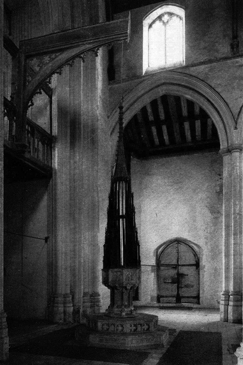
Church of SS. Peter and Paul, Salle, Norfolk.
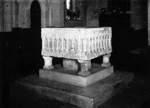
St. Mary’s, Hendon, Middlesex.
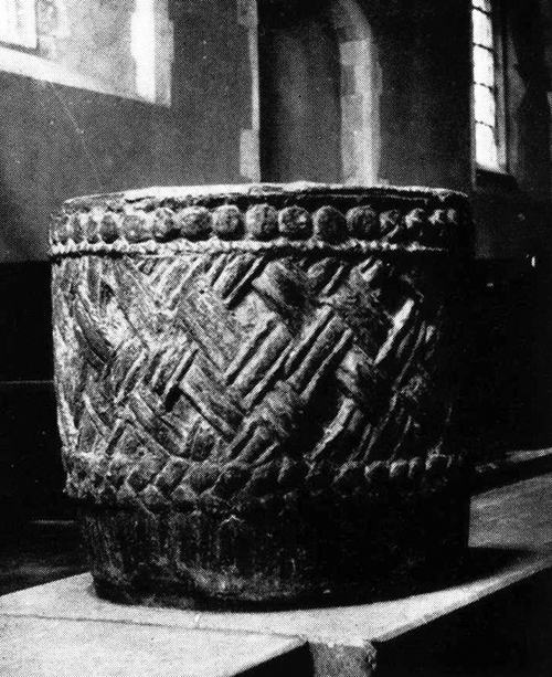
Twelfth-century font at Denton, Sussex.
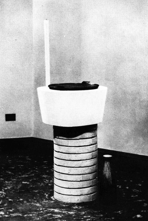
St. Columba, Corby. A modern font by the Warham Guild to the design of Colin Shewring, A.R.I.B.A.